
A History of Giant Letters
AND RELATED CONCEPTS
by Alan B. Scrivener
I've long had a fascination with giant letters, and decided to research their history in both theory and practice.

1686 — the first known Traffic Regulation Act in Europe is established by King Peter II of Portugal. This act foresees the placement of priority signs in the narrowest streets of Lisbon, stating which traffic should back up to give way. One of these signs still exists at Salvador street, in the neighborhood of Alfama.
( en.wikipedia.org/wiki/Traffic_sign )
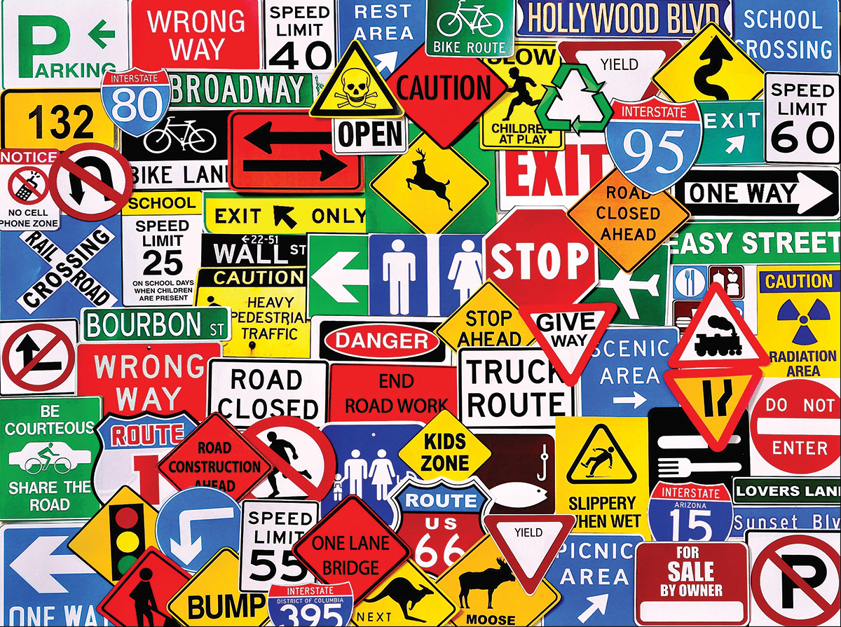
1870s — first traffic signs (besides milestones and town names) created for pennyfarthing bicyclists
( en.wikipedia.org/wiki/Traffic_sign )
1887 — Twinings Tea begins using logo — has been in continuous use since
( https://247wallst.com/special-report/2014/06/19/10-oldest-company-logos-in-the-world/2 )

1904 — giant "L" on side of Mount Ball installed by students from Lahainaluna High School, Maui, HI, the oldest U.S. high school west of the Rocky Mountains (founded in 1831)
( www.revolvy.com/main/index.php?s=Hillside%20letters&item_type=topic )
Growing up in La Mesa, California (near San Diego), a peak called Cowles Mountain loomed over us with a giant white "G" standing for "Grossmont," the name of a local high school. By the time I was a student at Grossmont High in 1967, the annual paining of the "G" by the senior class was cancelled due to ecological concerns.
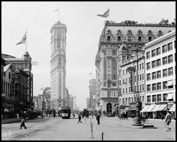
1904 — Times Tower built, defining Times Square
( skyscraper.org/EXHIBITIONS/TIMES_SQUARE/nw_times.php )
1910 — first neon sign by Georges Claude, shown at Paris Motor Show
( www.aps.org/publications/apsnews/201512/physicshistory.cfm )

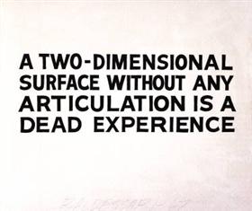
1913 — essay: "Ornament and Crime" by Adolf Loos
( www.amazon.com/exec/obidos/ASIN/1572410469/hip0bd-20 )
The "Modern Architecture" movement, also known as the "International Style," managed by the 1920s to pretty much ban ornament, which lasted about 60 years. In other words, the effect of buildings as communications, and their effect on the human spirit, was to be completely disregarded.


1921 — the Federal Aid Highway Act of 1921 established Route 66
( www.nps.gov/nr/travel/route66/origins_of%20Route66.html )
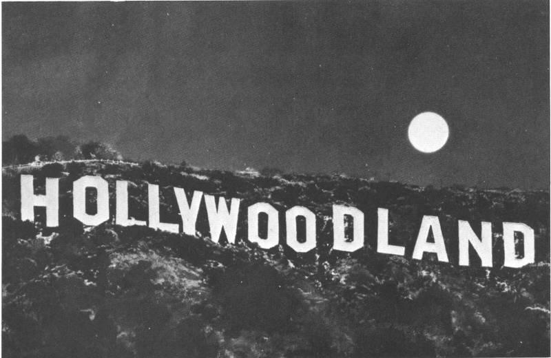
1922 — HOLLYWOODLAND sign
The sign originally advertised a housing development called Hollywoodland; later the "land" was removed during a refurb funded by public subscription.

1923 — giant letters placed on a hill overlooking South San Francisco, saying "SOUTH SAN FRANCISCO THE INDUSTRIAL CITY"
( en.m.wikipedia.org/wiki/South_San_Francisco_hillside_sign )

1923 — first neon in U.S.: Packard signs in Los Angeles, CA
( www.riversneon.com/neon-history )

1924 — "Typography can, under some conditions, be an art." — Kurt Schwitters, Dada collage artist
( en.wikipedia.org/wiki/Kurt_Schwitters )

1925 — first motel: the Milestone Mo-Tel (later Motel Inn) founded in San Luis Obispo, CA
( en.wikipedia.org/wiki/Motel_Inn )

1927 — Hollywood Roosevelt Hotel built with giant roof sign
( en.wikipedia.org/wiki/The_Hollywood_Roosevelt_Hotel )
Many hotels had giant signs on their roofs; I haven't been able to determine which was first.
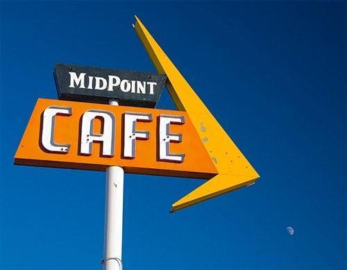
1928 — Midpoint Cafe built at Route 66 midpoint, Adrian, TX
Met new owner Dennis, who took over a couple years ago from Fran, who now owns the gift shop next door. Fran is the real life inspiration for "Flo" in the animated "Cars" movie.
— a Yelp reviewer ( www.yelp.com/biz/midpoint-cafe-and-gift-shop-adrian )
( www.roadsideamerica.com/tip/18921 )
I use the Midpoint Cafe to stand for an explosion of roadside signage in the 1920s and beyond.
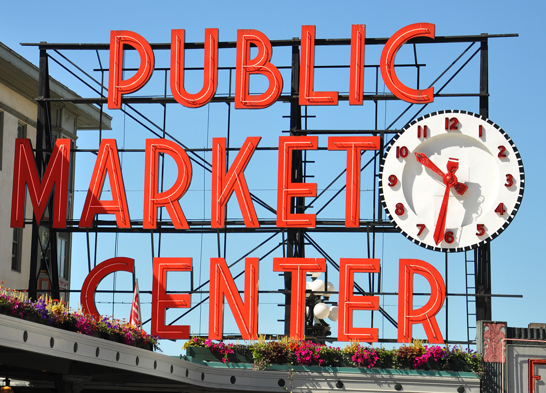
1930 — Public Market Center in Seattle, WA (built 1907) adds giant sign
( en.wikipedia.org/wiki/Pike_Place_Market )
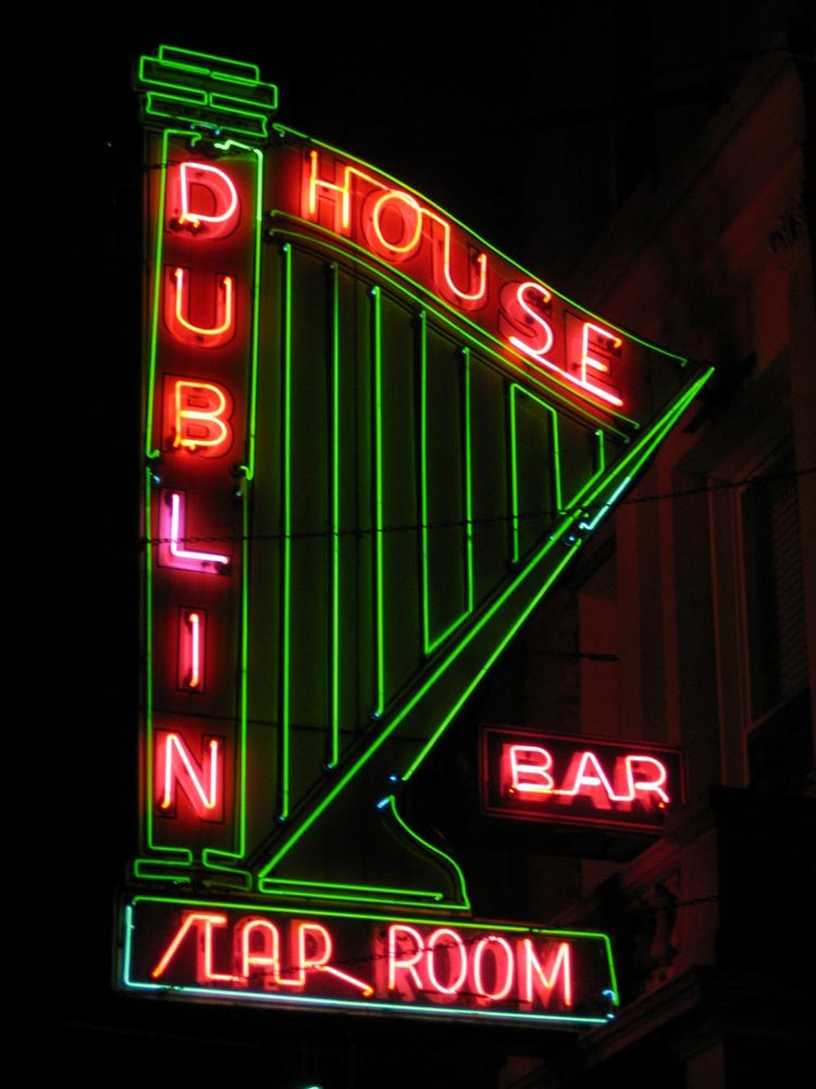
1933 — Dublin House neon, NYC
Dublin House Bar, 225 West 79th Street, Manhattan. Installed 1933, E.G. Clarke Inc. One of the oldest functioning neon signs on Earth. Long tails off the "T" and "P" in "TAP" are evidence that this part of the sign has been re-lettered (it used to say "RESTAURANT").

1937 — world's largest M built, Platteville, WI (later students added T and V for a prank)
( www.roadsideamerica.com/tip/2332 )

1938 — Mussolini's giant M gate
( theblogofwar.com/post/46507271268/a-giant-m-installed-to-greet-mussolinis-arrival )
If you think giant letters seem fascist, take comfort that the Fascists apparently agreed.
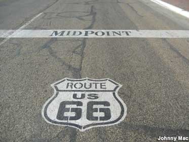
1938 — last segment of Route 66 paved between Adrian, TX and Glenrio, TX
( www.legendsofamerica.com/66-timeline )
Adrian, TX seems to be doing okay even though it was bypassed by I-40 about 50 years ago.
![]()
( www.theroute-66.com/glenrio.html )
Glenrio, TX not so much.

1939 — film: "Union Pacific" directed by Cecil B. Demille, has perhaps the first "crawl" in the credits, inspiring "Flash Gordon" (1940) and "Star Wars" (1977)
( en.wikipedia.org/wiki/Star_Wars_opening_crawl )

1943 — Times Square smoking billboard
( viewing.nyc/vintage-photograph-from-1943-shows-famous-smoking-camel-billboard-in-times-square )
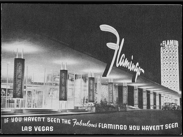
1946 — notorious mobster Benjamin "Bugsy" Siegel opened the Pink Flamingo Hotel & Casino in Las Vegas, NV
( www.nationalcrimesyndicate.com/day-1946-pink-flamingo-hotel-casino-opened )

1953 — Desert Rose Motel opens, Las Vegas, NV
( vegasclick.com/casinos/timeline )

1954 — Anaheim mall designed by Welton Becket (1959 photo)
Orange County's very first shopping mall. This was taken before a J.W. Robinson's anchor store was added to its north end. Over the years, the retail complex would be known as BROADWAY ORANGE COUNTY CENTER, BROADWAY ANAHEIM CENTER, ANAHEIM CENTER and (finally) ANAHEIM PLAZA.
This early shopping mall is germane because in 1996 it was refurbed with giant letters; also the original designer, Welton Becket, had an amazing career as a rare architect in the Modern era who was willing to give the clients more of what they wanted, including ornament.
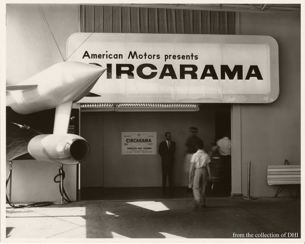
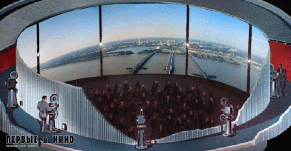
1955 — "Circarama" (later "Circle Vision 360") opens at Disneyland in Anaheim, CA
( www.yesterland.com/circarama.html )
The Walt Disney Company has gained valuable experience shooting in a 360 degree format, experience which no other film studio has. They have learned to put most of the interesting stuff on the "front" screen, but also have ambient details to be seen in all directions. One day we will be deciding what moving images to display on the four wall-sized screens of rooms in our homes and places of business, and lessons learned from this experience may prove useful.

1956 — Hacienda Casino Hotel opens in Las Vegas, NV ( vegasclick.com/casinos/timeline )
The old Vegas casinos had marquee signs which had to be changed by hand using long poles.

1961 — Lighting and sign designer and entrepreneur Douglas Leigh buys the Times Tower, which becomes known as One Times Square, with a plan to turn the building into "a showcase for signs."
( skyscraper.org/EXHIBITIONS/TIMES_SQUARE/nw_times.php )

1963 — "I AM A MONUMENT" proposal by Venturi & associates for Boston City Hall
Venturi's ideas must be understood as representing a revolt against much of contemporary architecture. His book is an attack on those high-handed architects who see themselves as setting standards of architectural excellence. They fill our landscape with imposing, heroic forms which are all too familiar — a Gund Hall, a new Science Center, or a Boston City Hall. Venturi is interested in the sort of architecture that has no pretension to being heroic. He implies that there is nothing to be learned from these self-conscious monuments to good taste. Rather he looks to the more low-brow, eclectic architecture of the strip as a source of style.
Venturi and associates recognized that an architectural project often involved a compromise between the client's operational needs and the architect's ego needs. Apparently they felt the balance of power had moved way over to the architect's side. I see the "decorated shed" as an attempt to meet more client needs with a generic, flexible building, having all the ego expression concentrated in a billboard (which can be easily removed later).

1964 — 1964 World's Fair Alaska Pavilion
( en.wikipedia.org/wiki/1964_New_York_World%27s_Fair )

1964 — book: "God's Own Junkyard: The Planned Deterioration of America's Landscape" by Peter Blake
( www.amazon.com/exec/obidos/ASIN/0030474310/hip0bd-20 )
This famous screed railed against the ugliness of vernacular commercial design. Others disagreed.

1964 — Carol Doda became the first topless dancer in the USA, at the Condor Club in San Francisco
( en.wikipedia.org/wiki/Carol_Doda )
1964 — essay: "LAS VEGAS (What?) LAS VEGAS (Can't hear you! Too noisy) LAS VEGAS!!!!" by Tom Wolfe, Esquire Magazine, reprinted in "The Kandy-Kolored Tangerine-Flake Streamline Baby" (1965)
( www.amazon.com/exec/obidos/ASIN/0312429126/hip0bd-20 )
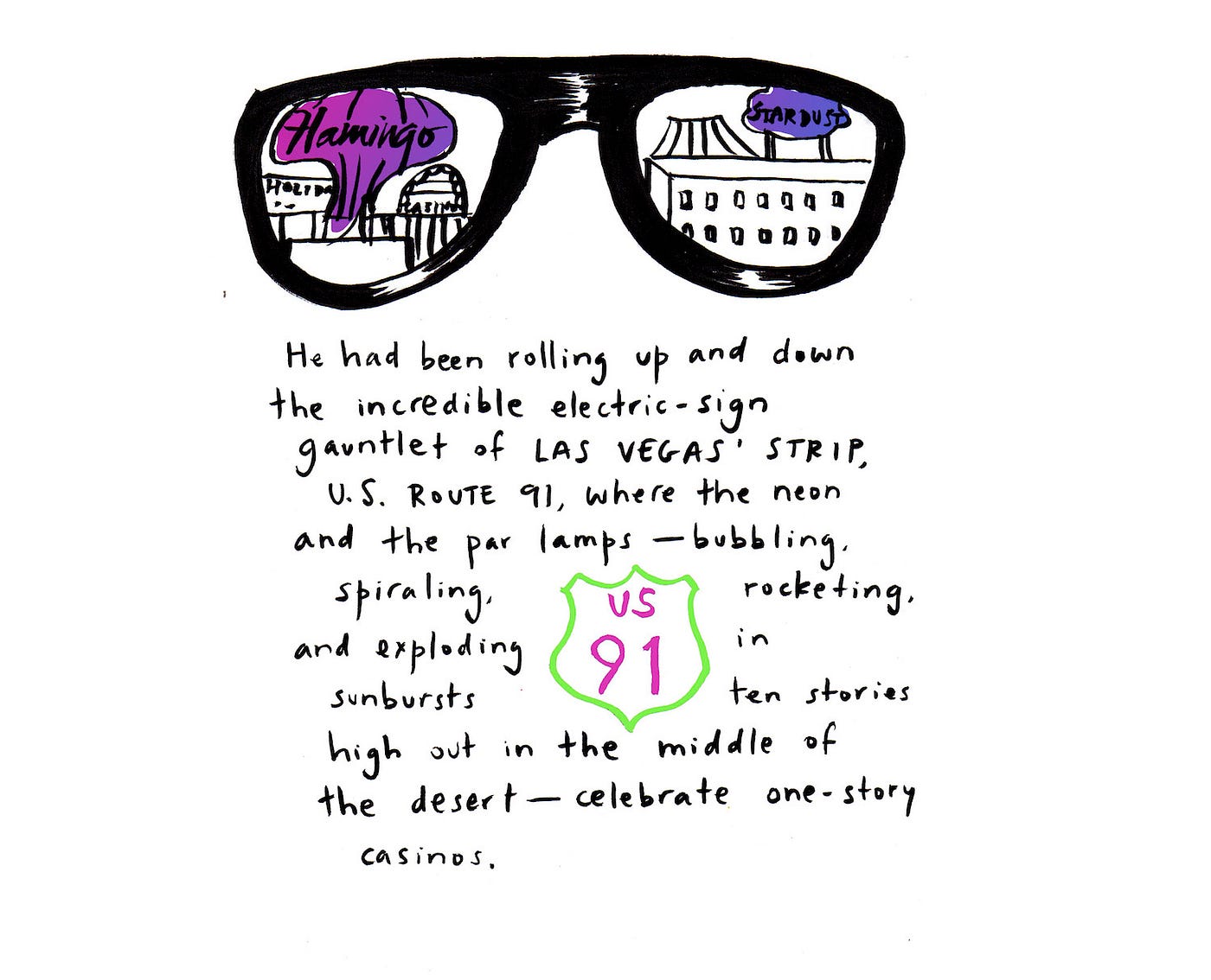
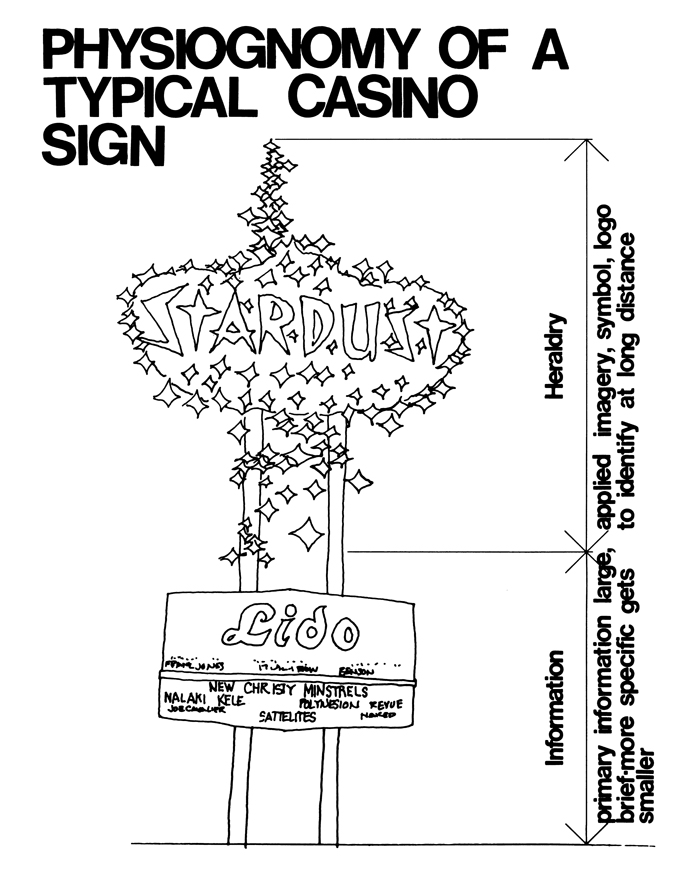
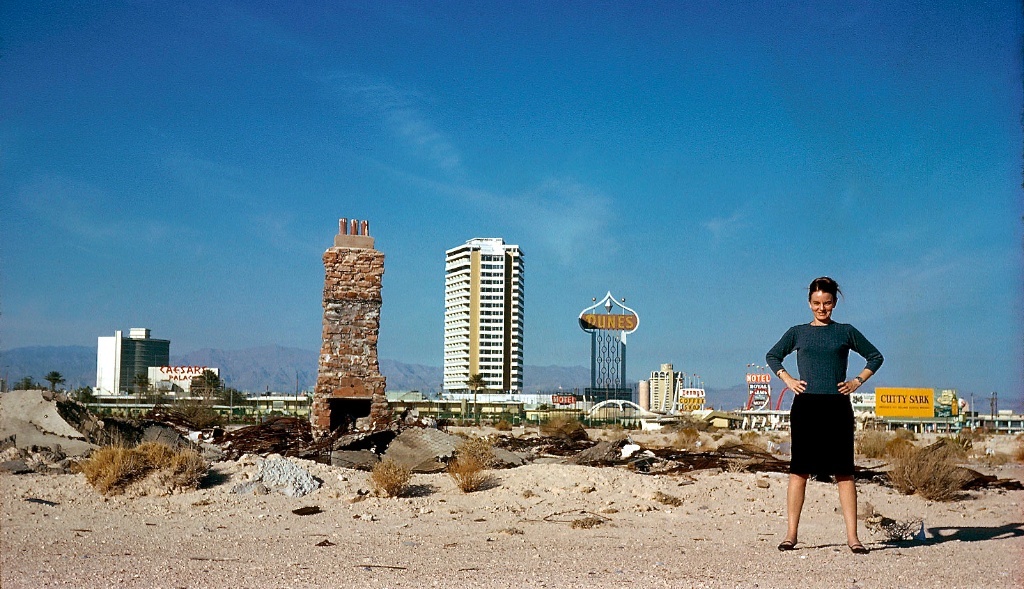
Las Vegas is the only town in the world whose skyline is made up neither of buildings, like New York, nor of trees, like Wilbraham, Massachusetts, but signs. One can look at Las Vegas from a mile away on Route 91 and see no buildings, no trees, only signs. But such signs! They tower. They revolve, they oscillate, and they soar in shapes before which the existing vocabulary of art history is helpless. I can only attempt to supply names — Boomerang Modern, Palette Curvilinear, Flash Gordon Ming-Alert Spiral, McDonald's Hamburger Parabola, Mint Casino Elliptical, Miami Beach Kidney. Las Vegas' sign makers work so far out beyond the frontiers of conventional studio art that they have no names themselves for the forms they create. Vaughan Cannon, one of those tall, blond Westerners, the builders of places like Las Vegas and Los Angeles, whose eyes seem to have been bleached by the sun, is in the back shop of the Young Electric Sign Company out on East Charleston Boulevard with Herman Boernge, one of his designers, looking at the model they have prepared for the Lucky Strike Casino sign, and Cannon points to where the sign's two great curving curving faces meet to form a narrow vertical face and says: "Well, here we are again — what do we call that?" "I don't know," says Boernge. "It's sort of a nose effect. Call it a nose." Okay, a nose, but it rises sixteen stories high above a two-story building. In Las Vegas no farseeing entrepreneur buys a sign to fit a building he owns. He rebuilds the building to support the biggest sign he can get up the money for and, if necessary, changes the name. The Lucky Strike Casino today is the Lucky Casino, which fits better when recorded in sixteen stories of flaming peach and incandescent yellow in the middle of the Mojave Desert. In the Young Electric Sign Co. era signs have become the architecture of Las Vegas, and the most whimsical, Yale-seminar-frenzied devises of the two late geniuses of Baroque modern, Frank Lloyd Wright and Eero Saarinen, seem rather stuffy business, like a jest at a faculty meeting, compared to it.

1965 — Kaiser Channel 44 KBH TV Studio by Barbara Stauffacher Solomon
( www.barbarastauffachersolomon.com/blogs/news/the-big-bold-world-of-barbara-stauffacher-solomon )
Barbara Stauffacher Solomon was a pioneer of supergraphics, and is still a practicing designer in 2018, at the age of 89; she now works primarily on "green" architecture.

1966 — Fire Station Number Four, Venturi, Rauch and Scott Brown, Columbus, IN
see also: columbus.in.us/fire-stations
The giant "4" on this fire station is one of the first uses of supergraphics in an architectural exterior.

1966 — book: "Complexity and Contradiction in Architecture" by Venturi et. al.
Designing from the outside in, as well as the inside out, creates necessary tensions, which help make architecture. Since the inside is different from the outside, the wall — the point of change — becomes an architectural event. Architecture occurs at the meeting of interior and exterior forces of use and space. These interior and environmental forces are both general and particular, generic and circumstantial. Architecture as the wall between the inside and the outside becomes the spatial record of this resolution and its drama. And by recognizing the difference between the inside and the outside, architecture opens the door once again to an urbanistic point of view.

1966 — book: "Fahrenheit 451" (film, based on the 1953 novel by Ray Bradbury) directed by François Truffaut
( en.wikipedia.org/wiki/Fahrenheit_451_(film) )
Unlike Bradbury's novel, Truffaut's film posits a world in which the Latin alphabet has gone extinct, replaced by audio and video technologies; only numbers remain, and they appear as supergraphics.

1967 — term supergraphics coined
Supermannerist architect Charles W. Moore designed a large condominium project at Gualala, California, in the mid-1960s. He called on graphic designer Barbara Stauffacher Solomon to bring the walls and ceilings of this large architectural project to life through the application of color and shape. Solomon, a San Francisco native and painter who had studied graphic design at the Basel School of Design during the late 1950s, used a pallet of pure hue and elementary shape in compositions that transformed the totality of the space. In 1970 the American Institute of Architects presented its medal to Solomon for "bold, fresh, and exciting designs clearly illustrating the importance of rational but vigorous graphics in bringing order to the urban scene."Both the name supergraphics and the idea caught the public's fancy; by 1970 supergraphics were being used in corporate identification systems, in interior design for shops and boutiques, and to brighten factory and school environments, bringing about greater graphic-design involvement in environmental design.

1967 — Venturi & associates, National Collegiate Football Hall of Fame (Competition)
( www.quondam.com/41/4110.htm )
This unbuilt museum project by Venturi & associates uses a football stadium scoreboard as the signage visible from the freeway. I have been searching for the first mention by Venturi et. al. of the idea of using pixels on the exterior of buildings; haven't found it yet. This project presages that idea.

late 1960s — supermannerism
Mannerism, also known as Late Renaissance, is a style in European art that emerged in the later years of the Italian High Renaissance around 1520 and lasted until about end of the 16th century in Italy, when the Baroque style began to replace it...Stylistically, Mannerism encompasses a variety of approaches influenced by, and reacting to, the harmonious ideals associated with artists such as Leonardo da Vinci, Raphael, and early Michelangelo. Where High Renaissance art emphasizes proportion, balance, and ideal beauty, Mannerism exaggerates such qualities, often resulting in compositions that are asymmetrical or unnaturally elegant. The style is notable for its intellectual sophistication as well as its artificial (as opposed to naturalistic) qualities. It favors compositional tension and instability rather than the balance and clarity of earlier Renaissance painting. Mannerism in literature and music is notable for its highly florid style and intellectual sophistication.
During the 1960s, supermannerism and supergraphics were words coined to describe breaks with modern design. Like many art history labels, supermannerism was first used disparagingly. Mannerism was originally used as a label for the stylish art of the 1500s, which broke with the natural and harmonious beauty of the High Renaissance. Mannerism departed from Renaissance norms by taking liberties with the classical vocabulary of form; the term supermannerism was first used by advocates of the purist modern movement to describe work by young architects whose expanded formal range embraced the pop-art notion of changing scale and context. Zigzag diagonals were added to the horizontal and vertical structures of modern architecture. An architecture of inclusion replaced the machine aesthetic and simple geometric forms of the international style.In the late 1960s, the application of graphic design to architecture in large-scale environmental graphics extended the formal concepts of art concret and the International Typographic Style. Supergraphics became the popular name for bold geometric shapes of bright color, giant Helvetica letterforms, and huge pictographs warping walls, bending corners, and flowing from the floor to the wall and across the ceiling, expanding or contracting space in scale changes relative to the architecture. Psychological as well as decorative values were addressed, as designers created forms to enliven dismal institutional architecture, reverse or shorten the perspective of endless hallways, and bring vitality and color to the built environment.

1968 — movie: "Yellow Submarine" with the Beatles has giant letters spelling "LOVE" and "YES"
( www.rogerebert.com/reviews/great-movie-yellow-submarine-1968 )
1969 — Monty Python's Flying Circus formed
( en.wikipedia.org/wiki/Monty_Python )
They often derived humor from giant letters, as part as an overall mannerist approach to comedy. (I learned a new word and I'm already using it!)

1969 — TV show: "Sesame Street" began teaching children the alphabet using "commercials" for letters
( en.wikipedia.org/wiki/Sesame_Street )

1972 — book: "A Significance for A&P Parking Lots, or Learning From Las Vegas" by Robert Venturi, Steven Izenour and Denise Scott-Brown
THE ARCHITECTURE OF THE STRIPIt is hard to think of each flamboyant casino as anything but unique, and this is as it should be, because good advertising technique requires the differentiation of the product. However, these casinos have much in common because they are under the same sun, on the same Strip, and perform similar functions; they differ from other casinos say, on Fremont Street and from other hotels that are not casinos .
A typical hotel-casino complex contains a building that is near enough to the highway to be seen from the road across the parked cars, yet far enough back to accommodate driveways, turnarounds, and parking. The parking in front is a token: It reassures the customer but does not obscure the building. It is prestige parking: The customer pays. The bulk of the parking, along the sides of the complex, allows direct access to the hotel yet stays visible from the highway. Parking is seldom at the back. The scales of movement and space of the highway relate to the distances between buildings; because they are far apart, they can be comprehended at high speeds. Front footage on the Strip has not yet reached the value it once had on Main Street, and parking is still an appropriate filler. Big space between buildings is characteristic of the Strip...
Casino fronts on the Strip often inflect in shape and ornament toward the right, to welcome right-lane traffic. Modern styles use a porte cochere that is diagonal in plan...
THE INTERIOR OASIS
If the back of the casino is different from the front for the sake of visual impact in the autoscape, the inside contrasts with the outside for other reasons. The interior sequence from the front door back, progresses from gambling areas to dining, entertainment, and shopping areas to hotel. Those who park at the side and enter there can interrupt the sequence. But the circulation of the whole focuses on the gambling rooms. In a Las Vegas Hotel the registration desk is invariably behind you when you enter the lobby; before you are the gambling tables and machines. The lobby is the gambling room. The interior space and the patio, in their exaggerated separation from the environment, have the quality of an oasis.

1976 — BASCO Showroom (Philadelphia, PA) by Venturi, Rauch, Scott Brown and Assoc., architects
( www.quondam.com/41/4188.htm )

1978 — BEST Showroom Oxford Valley, PA, Venturi and Assoc., architects
( architecturemag.typepad.com/my_weblog/2006/07/the_next_best_t.html )
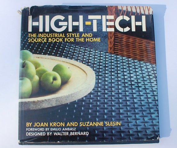
1978 — book: "High Tech: The Industrial Style and Source Book for The Home," written by design journalists Joan Kron and Suzanne Slesin and published in November 1978
( www.amazon.com/exec/obidos/ASIN/051753262X/hip0bd-20 )
I find it fascinating that the term "high tech" was most likely coined by interior designers. In the 1970s, even though we had seen 50 years of Modern Architecture, interior design still embraced ornament, to the point where it was nearly impossible to find unornamented furnishings and fixtures in most furniture stores. Avant-garde architects designing ultra-modern summer cottages in the Hamptons took the radical step of using commercial, industrial and laboratory supplies as furniture. This book was designed to give access to many folks yearning for an alternative the ornate Colonial, Classical and Victorian styles of interiors the time.

1978 — video: "Every Little Step" Bobbie Brown
( www.youtube.com/watch?v=P0FKzPfsxA4 )


1979 — Sam's Town Hotel and Gambling Hall opens near Las Vegas, NV
( en.wikipedia.org/wiki/Sam%27s_Town_Hotel_and_Gambling_Hall,_Las_Vegas )
This casino has been particularly swift in upgrading their electron signage with new tech as it comes along, ensuring crisp color even in direct sunlight as well as at night.
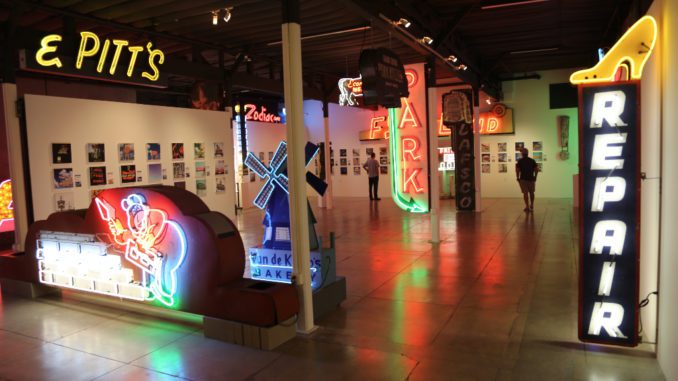
1981 — Museum of Neon Art (MONA) founded in 1981 in Los Angeles by artists Lili Lakich and Richard Jenkins
( www.californiacuriosities.com/neon-museum )

1981 — book: "From Bauhaus to Our House" by Tom Wolfe
Venturi often praised the Pop artists of the 1960s, as if they were reestablishing some sort of tie between high art and popular culture. Venturi's strategy was, in fact, precisely like that of the Pop artists — and neither had any interest, beyond the playful and camp, in popular culture. Pop Art was not a rebellion. The Pop artists, no less than the abstract expressionists whom they eclipsed, still religiously observed the central tenets of modernism concerning flatness ("the integrity of the picture plane") and nonillusionism. They were careful to do only pictures of other pictures — labels, comic-strip panels, flags, pages of numbers — so that their fellow hierophants in the Modern movement would realize that they were not actually returning to realism. Jasper Johns' proponents said that his pictures of flags and numbers, for example, were the flattest and most nonillusionistic paintings yet, because they were of things that were by their very nature two-dimensional and abstract. Pop was a leg-pull, a mischievous but, at bottom, respectful wink at the orthodoxy of the day.

1981 — film: "One from the Heart" directed by Francis Ford Coppola, had Las Vegas miniatures designed by Dean Tavoulari, with miniature neon signs by neon artists Larry Albright and Bill Concannon
( www.imdb.com/title/tt0084445/trivia )

1982 — first US Festival with Mitsubishi Diamond Vision display
Mitsubishi entered the giant screen business in 1980, and in '82 they were showing off their technology at Steve Wozniak's outdoor music festival (funded by the profits he made from Apple Computer). The huge but fairly low-res screen was used for live display of the musical acts, but also between sets showed examples of the brand-new medium of "music videos." One that I especially recall was "Beautiful World" ( www.youtube.com/watch?v=56u6g0POvo0 ) by Devo. It's cartoonishly simple images went over well on the low-res display. Later when I encountered Venturi & company's ideas about covering buildings with pixels, I began to wonder, "What do we put on the pixels?" This experience of the Devo video gave me some of my first clues.

Also at this festival Mr. Wozniak had a "tech tent" set up, inviting vendors to display their harbingers of the future, and it was there that I saw MTV for the first time via satellite, showing the video "Rosanna" by Toto. ( www.youtube.com/watch?v=qmOLtTGvsbM ) Upon re-viewing and reflection it occurs to me that it contains images of an urban landscape such as trash, chain link fence, traffic signs and commercial signs — including a large yellow neon "PAWN."
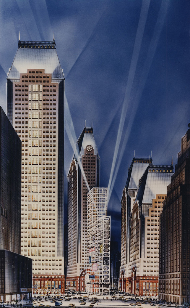
1984 — Philip Johnson unbuilt design for Times Square towers
( skyscraper.org/EXHIBITIONS/TIMES_SQUARE )
This design included a triangular lot with just scaffolding, with search lights shining up through it at night, to provide a surface for advertising signs facing Times Square, presaging more recent "deconstructivist" architecture theories. I think the client didn't "get it."

1985 — Route 66 officially decommissioned
( www.nps.gov/nr/travel/route66/demise_resurgence_of_route66.html )
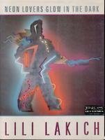
1986 — book: "Neon Lovers Glow in the Dark" by Lili Lakich
Benson, Arizona had been a thriving truck-stop for the cross-country highway before Interstate 10 was built and bypassed the town. South of Tucson, it was a neon paradise in the desert with spectacular pictorial signs.There was a neon truck the size of a semi in the sky for Marie's Truck Stop, a huge bull for Hank's Coffee Shop, a beautiful gold horse's head inside a horseshoe for the Horseshoe Cafe and even more dazzling beauties.
Since the town was bypassed, the businesses have collapsed, for the most part, and so have the neon signs.
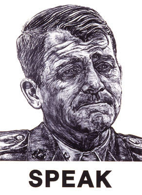
1987 — poster art: "Speak" (Oliver North) by Robbie Conal
( articles.latimes.com/1991-10-02/news/ga-2807_1_artist-robbie-conal/2 )

1989 — unbuilt proposal for US Pavilion at Expo 92, Seville, by Venturi, Scott Brown and Associates (VSBA)

1989 — art show and catalog: "A Forest of Signs: Art in the Crisis of Representation" by Ann Goldstein, Mary Jane Jacob, and Anne Rorimer (shown: work by Barbara Kruger, 1999)
( www.amazon.com/exec/obidos/ASIN/0262071193/hip0bd-20 )
( www.dazeddigital.com/artsandculture/article/20707/1/the-secret-history-of-moca )

1990 — mural: "Untitled (Questions)" by Barbara Kruger, on outside of "Temporary Contemporary" (now the "Geffen Contemporary") in Los Angeles
( manpodcast.com/portfolio/no-36-barbara-kruger-karen-wilkin )

1991 — music video: "Right Now" Van Halen
( www.youtube.com/watch?v=rMV-fenGP1g )

1992 — rock band U2 launched the ZooTV tour
( www.youtube.com/watch?v=9f3BuNkmOXg )
Heavily influenced by contemporary video artists, U2 put together a stage full of giant TV screens, upon which they mostly displayed giant letters forming provocative phrases, often sequenced at nearly-subliminal speeds.

They also invited video artists to create "ambient" sequences to loop on the giant screens, which included fields of daisies in color, and out-of-focus running buffalo in black and white. A music video for the band's song "One" ( www.youtube.com/watch?v=BgZ4ammawyI ) recycled some of these loops, and their record label asked for a do-over, finding "ambient" to be "boring." (But that's another story.)

I returned to this material in my quest to answer the question of what to put on the pixels on building exteriors.

1993 — book: "Signs of Our Times (Recollectibles)" by John Margolies and Emily Margolin Gwathmey
( www.amazon.com/exec/obidos/ASIN/1558592091/hip0bd-20 )

1993 — Children's Museum Houston, Venturi and associates architects
( www.nytimes.com/1993/08/22/arts/architecture-view-for-children-pop-goes-the-museum.html )
1994 — essay: "Aliasing: the Blind Spot of the Computer Industry" article in WIRED by Nicholas Negroponte
( www.wired.com/1994/01/negroponte-10 )
Meanwhile in 1990s the software folks were working on better tech for displaying text with pixels, including refinement of the techniques of "antialiasing" to reduce "jaggies."

1995 — Shuji Nakamura, Isamu Akasaki, and Hiroshi Amano were awarded the 2014 Nobel Prize in physics for their invention of blue LED in 1995
( www.yalescientific.org/2015/01/qa-what-makes-blue-led-light-so-special )
Red Light Emitting Diodes (LEDs) came first in in the 1950s, followed closely by green. These two could be combined to give yellow. But it wasn't until the blue LED was invented that we could do full RGB on giant, low power, bright displays.
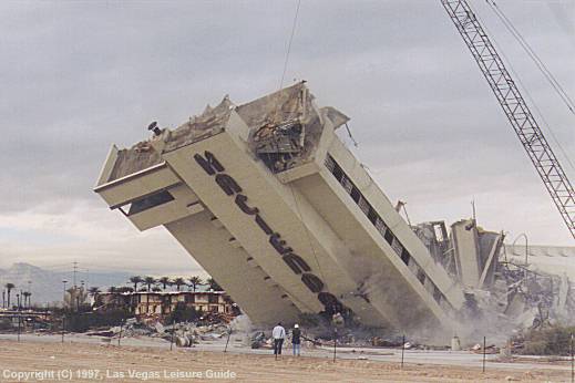
1996 — Hacienda Casino Hotel imploded in Las Vegas, NV
( www.lasvegas-nv.com/news/hacienda-hotel.htm )
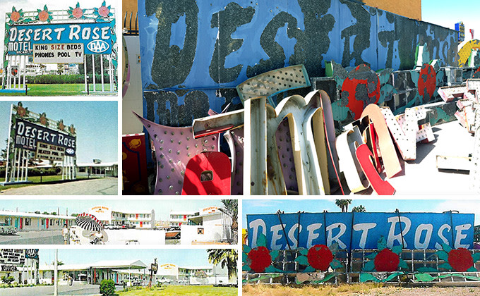
1996 — Desert Rose Motel demolished in Las Vegas, NV to make way for the Monaco
Luckily the signage was saved by the Young Electric Sign Company (YESCO) and later donated to the Neon Museum, which has an Indiegogo project to restore it.
( https://www.indiegogo.com/projects/neon-museum-desert-rose-sign-repainting#/ )
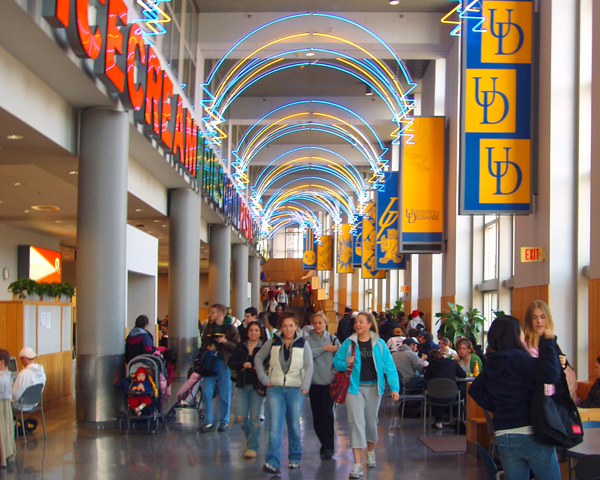
1996 — Trabant Center, University of Delaware, Venturi, Scott Brown and Associates (VSBA)
( www.vsba.com/projects/university-of-delaware-trabant-university-center )
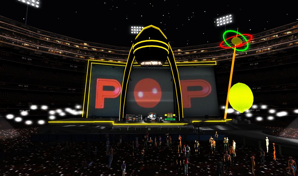
1996 — U2 launched Pop Mart tour
( www.youtube.com/watch?v=XIFR7ClqhZk )
With blue LEDs available U2 was able to build the world's largest video display for this new, deliberately (but ironically) crassly commercial tour. When we saw their tour date in the Los Angeles Coliseum in 1997, Bono walked out on stage, pointed to the set pieces, and said, "Look at what we did with all the money you gave us!"
Again they invited fine artists to create ambient video loops, including some not normally associated with video, such as graffiti artist Keith Haring. This is also material I returned to for pixel-fodder.

1996 — book: "Iconography and Electronics upon a Generic Architecture: A View from the Drafting Room" by Robert Venturi
( www.amazon.com/exec/obidos/ASIN/0262720299/hip0bd-20 )
From the title on down this manifesto advocates for covering generic architecture with electronic displays, for flexibility of messaging.

1996 — Anaheim Plaza refurb with giant letters visible from I-5
redeveloped by Donahue Shriber, Newport Beach
I'm still trying to figure out who the architect was for this refurb.
1996 — Neon Museum founded in Las Vegas, NV ( www.neonmuseum.org/about )
The museum formally took over the informal function of the YESCO boneyard. In the '80s I climbed through tumbleweeds in a drainage ditch to take pictures of dead neon signs baking in the desert sun, through a chain link fence. Now you can pay $15 and comfortably walk around them.


1997 — Angel Stadium of Anaheim signage and giant ballcap after refurb
( en.wikipedia.org/wiki/Angel_Stadium )

1998 — Frank G. Wells building, the Walt Disney Company, Burbank, CA, by Venturi, Scott Brown and Associates (VSBA)
( segd.org/frank-g-wells-building )
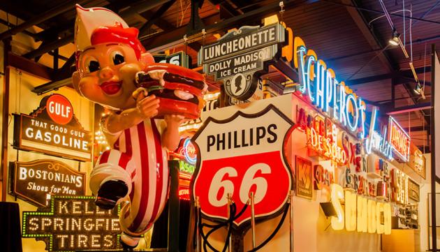
1999 — American Sign Museum opens in Cincinnati, OH
( www.americansignmuseum.org )

1999 — The National Park Service Route 66 Corridor Preservation Program
In recognition of the significance of Route 66 to America's heritage, Congress passed Public Law 106-45 in 1999 to create the Route 66 Corridor Preservation Program. Administered by the National Park Service, National Trails Intermountain Region, the program preserves the special places and stories of this historic highway. The program collaborates with private, nonprofit, and government partners to identify and prioritize Route 66 preservation needs. The program provides cost-share grants to help preserve the most significant and representative historic sites related to the route's period of significance (1926-1985). It also assists preservation planning, research, and educational initiatives, and serves as a clearinghouse for preservation information and technical assistance. Since 2001, over 100 projects have received cost-share grant assistance across the route.Set to legislatively terminate at the end of 2009, the program was reauthorized on March 30, 2009 for an additional 10 years. Under the new authorization, the program will continue to offer grants, technical assistance, clearinghouse functions, and pursue long-term priorities to sustain preservation efforts along Route 66.
The preservationist push didn't come from Washington, it came from the heartland. A dozen years after Route 66 was decomissioned, grassroots organizations were still lobbying for its return in a "historic" designation. The congress finally gave up and gave them what they wanted.
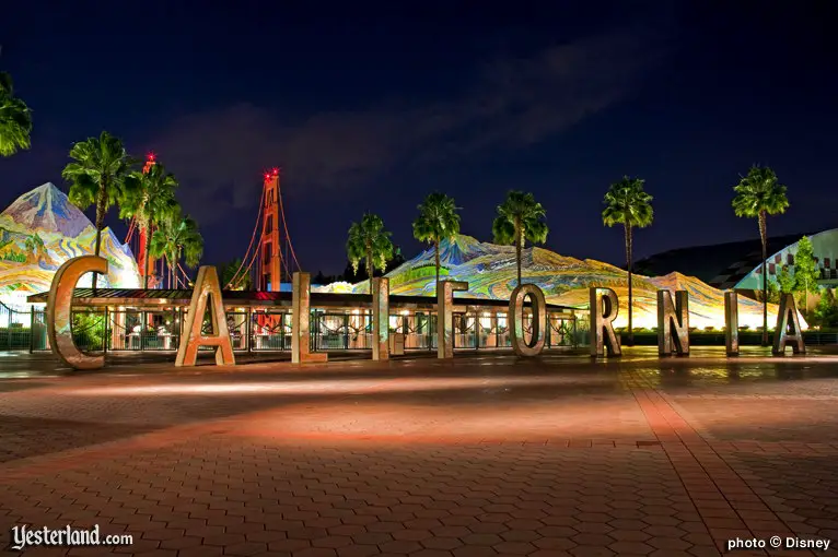
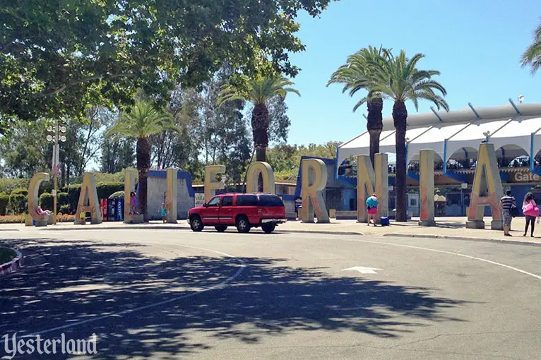
2001 — Disney's California Adventure entrance: giant "CALIFORNIA"
( www.yesterland.com/california.html )
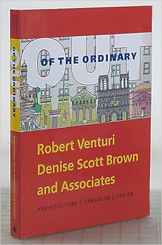
2001 — book: "Out of the Ordinary: Robert Venturi, Denise Scott Brown and Associates Architecture, Urbanism, Design" ( www.amazon.com/exec/obidos/ASIN/0876331487/hip0bd-20 )
I'm come to understand that Robert Venturi's secret weapon is his partner Denise Scott Brown, who is educated and experienced in urban design as well as architecture. I like to say that she knows what the sims want (the creatures that inhabit Sim City and similar computer games). When they talk about designing from the inside out, it is to perform the 3D function of a building in space; meanwhile, designing from the outside in involves recognizing a building's function as a sequence of 2D signs. Reconciling the two is the domain of subtlety, compromise, sometimes trickery, and ultimately artistry.
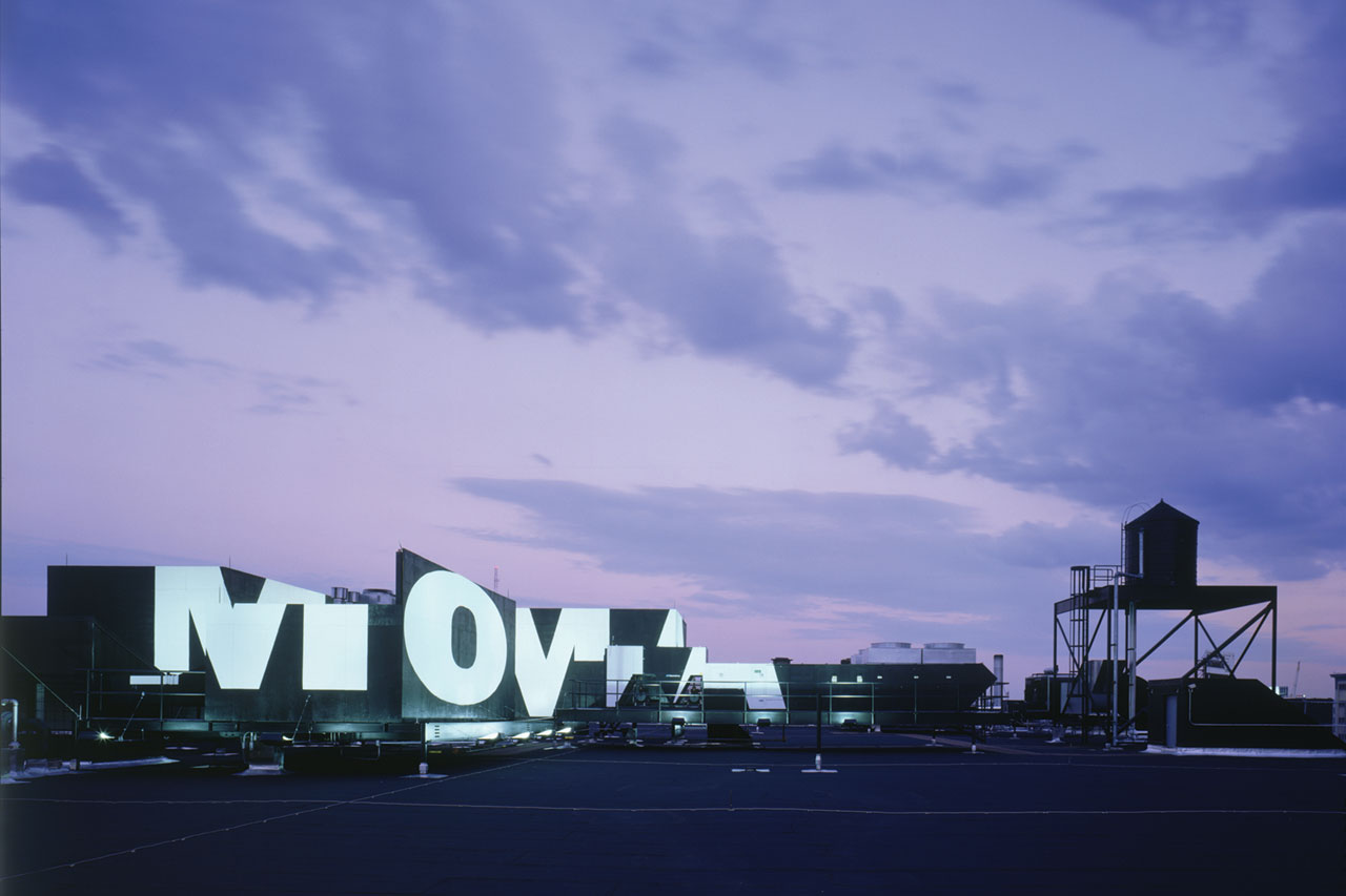
2002 — MoMA Queens, Michael Maltzan, architect
In 1999, the Museum of Modern art undertook a major expansion of its historic Manhattan facilities; in the interim a $35 million renovation of a Swingline Staples factory in Queens would become the Museum's home: MoMA QNS.

2004 — book: "Architecture as Signs and Systems: For a Mannerist Time (The William E. Massey Sr. Lectures in the History of American Civilization)" by Robert Venturi and Denise Scott Brown
( www.amazon.com/exec/obidos/ASIN/0674015711/hip0bd-20 )
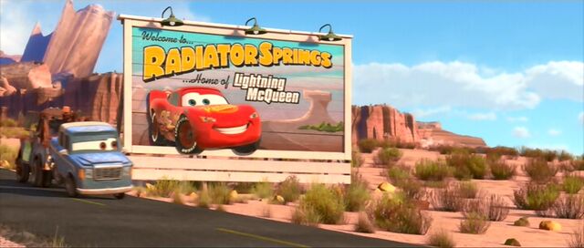
2006 — movie: "Cars" directed by John Lasseter
( www.route66news.com/2006/06/09/a-route-66-guide-to-the-cars-movie )


2008 — John Margolies collection of photographs archived at the Library of Congress
( www.loc.gov/item/2010650110 )
( www.insidehook.com/nation/free-john-margolies-digital-archive-opened )
( blogs.loc.gov/loc/2017/07/free-to-use-and-reuse-john-margolies-photographs-of-roadside-america )
2009 — The Pictures Generation, 1974-1984 was an exhibition at The Metropolitan Museum of Art (The Met) in New York City that ran from April 29 — August 2, 2009. (Shown: 1966 work by John Baldessari.)
( en.wikipedia.org/wiki/The_Pictures_Generation )

2009 — Diamond Vision was recognized by Guinness World Records in 2009, when two video boards measuring 72 feet by 160 feet at Cowboys Stadium (now AT&T Stadium) in Arlington, Texas were named the world's largest 1080p high-definition video displays. (Shown with tornado warning displayed.)
( en.wikipedia.org/wiki/Diamond_Vision )

2010 — book: "John Margolies: Roadside America" text by Phil Patton and C. Ford Peatross
( www.amazon.com/exec/obidos/ASIN/3836511738/hip0bd-20 )

2012 — "Belief + Doubt" Barbara Kruger
( hirshhorn.si.edu/collection/kruger-installation )
( latimesblogs.latimes.com/culturemonster/2010/12/moca-whitewashes-blu-mural.html
2012 — giant "CALIFORNIA" letters from Disney California Adventure relocated to California Exposition & State Fair (Cal Expo) in Sacramento, CA, home of the California State Fair
( www.yesterland.com/california.html )
2016 — June 08, 2016 John Margolies died
( www.latimes.com/travel/california/la-tr-0607-margolies-roadside-0602-snap-htmlstory.html )

2016 — Chelsea visits the studio of neon artist Lili Lakich
( www.youtube.com/watch?v=V72OpaRAWZg )

2017 — article: "Supergraphics: Is this OTT '70s Design Trend Making a Comeback?"
( www.apartmenttherapy.com/supergraphics-is-the-70s-design-trend-making-a-comeback-240144 )

2017 — video: "Repairing Giant Light Up Letters — A Day In The Shop"
( www.youtube.com/watch?v=ucdN8K6lDt8

2017 — November 30, 2017 Vincent Scully died
( en.wikipedia.org/wiki/Vincent_Scully )
Over the years, Scully came to regard the Modernists' victory as hollow, paving the way for a more historically informed approach, exemplified in particular by three architects whose work he interpreted and helped promote — Louis I. Kahn, his colleague at Yale; Robert Venturi; and the Italian Aldo Rossi — and by their disciples, who would reject orthodox modernism in favor of a more inclusive post-modernist approach to building and city form.
last update: Sun Jan 27 21:19:47 PST 2019