| Home Page |
Catalog |
Catalog Example 1 |
- ZoZa Site Overview
- Home Page
- Catalog
- Example 1
- Product
Search
- by Category
- by Product ID
- Product Presentation
- Add-to-Cart confirmation
- Checkout
Pipeline
- Login
- Cart Review
- Shipping Info
- Payment Info
- Order Confirmation
- 'Tell-a-Friend'
- Account Information
- Marketing
- Magazine
- Fabric
Story
- example Fabric Detail
- ZoZa Staff
- Zen
Marketing
- M.C. Comment
- Back Office
- Summary
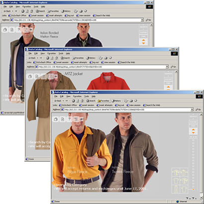
The Online Catalog was our sales tool. The goals were once again to be as uncluttered and text free as possible. Again the Cataloger's Dilemma struck, and we added links for promotions and to the search engine.
The Zieglers wanted to create an experience where visitors would be comfortable flipping through the pages one at a time, and get into a mood.
The site had to allow 'Merchandisers' to change the sequence of the images to support their sales plans, and to allow these changes to happen on a moments notice. The main barrier to this was once again getting the work through Creative.

In-Catalog navigation was supported by the 'thermometer' on the right hand side of the page. The Up and Down arrows would lead one through the sequence. Clicking on the little degree markers in the thermometer would jump you from page to page. As you rolled over the degree markers you would see 'architectural drawings' representing the clothing presented on each page. These silhouettes presented the visitor a quick way to look for attractive styles.
The underlying software design supported N number of Categories, such as Men's or Woman's, and N number of pages within each Category. As we modified the database more Categories would appear, and as we added or deleted Catalog pages in each Category the degree markers would come and go.
If a visitor wanted more details on a product they clicked on the photograph or the silhouette.