| ZoZa.com Overview |
ZoZa.Com Home Page |
Catalog |
- ZoZa Site Overview
- Home Page
- Catalog
- Example 1
- Product
Search
- by Category
- by Product ID
- Product Presentation
- Add-to-Cart confirmation
- Checkout
Pipeline
- Login
- Cart Review
- Shipping Info
- Payment Info
- Order Confirmation
- 'Tell-a-Friend'
- Account Information
- Marketing
- Magazine
- Fabric
Story
- example Fabric Detail
- ZoZa Staff
- Zen
Marketing
- M.C. Comment
- Back Office
- Summary
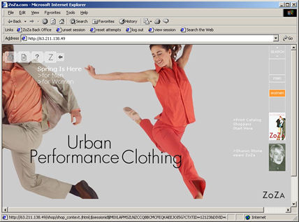
The Ziegler's design goals for the home page was to keep it as clutter-free as possible. The initial versions were very terse. However we soon ran into what I called the "Cataloger's Dilemma" - every square inch had to make a sale. As time went on we added more links to product specials and marketing material.
The odd looking thing in the upper left is a "collapsible" tool which provides links to Customer Support, a FAQ, a magazine, and Your Account. We called this the "Utility Belt." It was a response to the Ziegler's design goal of keeping the site as text free as possible but still providing the customary links and services. You see it in the expanded position.
The icon in the upper right lead to the Search and Hierarchical browse tools.
The men and woman's icons linked to what you think they lead to.
The ZoZa home page rotated whenever we could get images out of Creative.
In the Spring we had 4 separate home pages in production, each having different imagery..
